This is the final video which I took inspiration from for project 3, this was my favourite out of all the ones I looked at.
Wednesday, 15 December 2010
I Love What You're Wearing: London Street Style
This video also gave me inspiration for my short video project.
Elle UK London Street Style - fashion influences
This video I really liked as I really liked the angles that they used and how they put all the images together. From looking at the this video I will definatly check out elletv as it may give me some more inspiration for project 3. I will definalty think about the unique and visually interesting camera angles when putting together my 3 minute video.
Inspiration for Project 3
I have really struggled trying to find some solid ground to start my creative process of thinking about how I want my video to look and what message I'm trying to convey, so I have decided to look at other people's videos about fashion and see if I can get any inspiration from other peoples work.
Blake Lively is the New Face of Chanel
Anna Wintour had put Blake on three Vogue covers including the best dressed issue. After attending multiple Chanel fashion shows and being seen in Chanel Haute Couture on the runway, shooting a campaign for the fashion powerhouse was the natural next step for the Gossip Girl star.


The above picture is a photograph from Fashion Week in the Chanel maxi dress from the St Tropez Cruise collection. Below are more pictures of Blake Lively in different peices of Chanel.

Tuesday, 14 December 2010
My London Visit
From visiting London I have taken some video footage and lots of still photo's which I will then edit produce my 3 minute video. Below is some of the footage that I gathered.


Project 3; High Street Video Reportage
In this project we have been asked to record and document a personal snapshot view/video reportage on the phenomenom of British Fashion in London today.
From using a combination of video, still photo images and recording, I have been asked to record either an event, person, brand or style or a mixture of any. To then product a narrative video involving or related to Fashion, Communication, PR, Design or Culture on the high street, that this significant to current Fashion culture.
This project to me feels very broad and is a perfect way of expressing myself in my interests, style and generally to answer any questions that may frustrate or confuse me.
Project 2; Part 2
From looking a different magazines previously, I have now been able to make my third version for my magazine project incorporating all the aspects which I liked from each magazine to blend them together to make my version below.


 This is my favourite version of all the version's have done, and I'm very pleased with the outcome.


 This is my favourite version of all the version's have done, and I'm very pleased with the outcome.
Tuesday, 7 December 2010
Lanvin for H&M
I took a trip to London at the end of November to look at a number of exhibitions, luckily enough Lanvin for H&M was being launched on the 23rd November, so I took myself along to see the excitment for my own eyes. Below are some of the peices from the collection.


This collection was one of the most successful collaborations that H&M have done, people had queued up from 20.45 on the Monday evening when the collection was launched on the tuesday.
One word would describe it all perfect and that would be 'CRAZY'.
Wednesday, 17 November 2010
Tom Ford's Spring/Summer Collection 2011
Today the first official pictures of Tom Ford's Woman's Spring/Summer Collection 2011 were released.

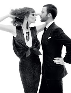


These are the first group of images which have been released, as more are to be released at a later date, which I look forward to getting my eye on.
Sunday, 14 November 2010
Magazine Research for Project 2; Part 2
To give me some inspiration to impove the magazine layout which I am creating for Project 2, I thought that I would look at other magazine which I enjoy reading and look at their layouts.


Harpers Bazaar I enjoy reading on a regular basis, however I don't like how they set their pages out hugely. I didn't think it would work for the article which I have chosen.
Vanity Fair is another magazine which i enjoy reading, and I also really like the way they set out their pages, I like how they arrange their images in an organised way, and I think this would work really well will the Wonderland article, as the Wonderland Magazine is very clean with their appearance. I also like how they have go their writing in two columns, I find one column a bit too rugid, and three columns very newspaper like, but I think the two columns is a perfect balance for a magazine. I also think this would work well within Wonderland magazine.
Another one of my favourite magazines is Vogue, this has been one of my favourite magazines for many years now and I continually read them every month. However the layout is very similar to Harpers Bazaar, therefore I don't think it would fit into Wonderlands overall look of their magazine.
From looking at the magazines which I read regularly it definatly will help me make a decision how I want my improved Wonderland article to look, I will base alot of it around Vanity Fair, with the positioning of the pictures and the layout of the text.
Friday, 29 October 2010
Project 2; Part 2
From my first draft, I didn't like the borders which I put round the images so I took them off, I liked how I arranged the images on page two, I think that is very effective, I also am very pleased with how page 3 & 4 look. On this version I put the boxes back in at the top like they have on the original article, as I think this is a nice way to set off the article. However I didn't like how I'd done page 4 & 5 so I have changed the layout of that completely which I think works really well. Finally by putting the random images of leaves occasionally it makes it a lot more contemporary in my view and I think it sets the article off very nicely.


This is my second draft.
Thursday, 28 October 2010
Project 2; Part 2
For Project 2, Part 2 I have been asked to reproduce the article I chose earlier and reproduce it to make it indidualised, so it's re-structured, re-styled and re-presented.


There are many things that I don't like about the layout of the article, one being that there's the writing straight down the middle, i prefer it in magazines where it's written in columns like in Vogue and Vanity Fair. I find that the article is also too ridgid and has no flexibility to it, again you wouldn't find this in a magazine like Vogue. However I do like the heading and how well it stands out, I think that works very well for the article. I also like how they've put quotes in boxes throughout the texts it makes the reader read them and it intices them into the article. I didn't like how they have used some of the images, as I feel the last page spread doesn't fit in with the article at all as it has no autumn feeling within it at all, and that last image makes me feel very wintery. Keeping all of my views in mind I then reproduced it which is shown below to how I thought it looked best.
This is my first draft.
Project 2; Part 1
In Project 2, Part 1 I have been asked to reproduce the article I chose earlier and reproduce it accurately, exactly and identically, which is shown below. I used in design to present it the way I have.


My Chosen Article; Project 2
Below is the article which I picked out of Wonderland.


 I chose this article, because I found the story very interesting to me and I also found the majority of pictures visually interested. I liked how it brought the current season into the article.


 I chose this article, because I found the story very interesting to me and I also found the majority of pictures visually interested. I liked how it brought the current season into the article.
 Saturday, 16 October 2010
Project 2; Magazine Feature Article; Represented & Individualised
For project two we have to select one main feature article from any Fashion, Communication, Design or Culture magazine that personally inspires and interests me. The article should include a double page spread and be a total of 6 pages. 

I wouldn't be suprised if they changed their style again in the next couple of issues considering their past of changing their style of the magazine.
The magazine which I have chosen for this project is Wonderland, I have chosen Wonderland because I find it visually interesting and the way that it's set out and laid out appeals to me.
I find Wonderland very interesting in it's approach because the way it looks now isnt the way it was when they launched the magazine. Below is an image of what it looked like when they launched the magazine.
I find Wonderland very interesting in it's approach because the way it looks now isnt the way it was when they launched the magazine. Below is an image of what it looked like when they launched the magazine.
I quite like this style which they have used now but I feel there's not really anything special and unique about it it's just following everyone else, and the type face for 'Wonderland' I don't think is visually appealing at all. They used this style up until Issue 7, and then they changed it looked like the image below:

I didnt like this style as much as I like the first one I felt this stlye was very childlike and didnt represent what they are as a magazine. They then changed their style again for Issue 14:

I this is my favourite style out of all the styles Wonderland have gone through and unsure why they changed their style again after this, I think this says something about them and gives off positive vibes of them as a magazine. They then changed their style slightly in their 17th issue which they have stuck to ever since.
I didnt like this style as much as I like the first one I felt this stlye was very childlike and didnt represent what they are as a magazine. They then changed their style again for Issue 14:
I this is my favourite style out of all the styles Wonderland have gone through and unsure why they changed their style again after this, I think this says something about them and gives off positive vibes of them as a magazine. They then changed their style slightly in their 17th issue which they have stuck to ever since.
I wouldn't be suprised if they changed their style again in the next couple of issues considering their past of changing their style of the magazine.
Friday, 15 October 2010
Wednesday 13th October; Digital Technology & Print Production; Adobe In Design & Photoshop Workshop
In this weeks workshop we made progress on what we had done last week. Firstly I was on Photoshop and was talked through the different types of selection tools. Then I practised how to use the magnetic lasso tool, which takes out the background of an image, and then after using the normal lasso tool to make the edges which need to be straight, straight so there aren't jaged edges for example around the border.
Then I learned how to make my own path.
After that I went onto working on In Design and put the work I had done in Photoshop onto design.
Finally we were breifed with Project 2.
Then I learned how to make my own path.
After that I went onto working on In Design and put the work I had done in Photoshop onto design.
Finally we were breifed with Project 2.
Thursday, 7 October 2010
Wednesday 6th October; Digital Technology & Print Production; Adobe In Design Workshop
Yesturday in my Digital Technology & Print Production workshop, George came and spoke to us about how to use Adobe In Design, which I've never used before so I found it quite a daunting experience. What I learnt from George, is as follows below.
Notes
Gutter means the space between each column. Bleeding an image is so that you don't have any white space around an image, this maybe used for a front cover of a magazine like Vogue.
The white space around the document is used for placing things there which you havn't decided what you're putting where yet.
Page Tool is used to make a certain page bigger, so if you wanted to have a front cover which flapped over in the inside cover, you would use this tool.
Gap Tool is used to move a picture and to change the size of the picture.
Type Tool is used to insert text and font size. For a publication it's wise to type it in a word document first and then import it into in design.
To import a text file:
Click 'File' then 'Place', find the file you want to attach click 'Open' and then place the text in which ever column you want it in. To make the text follow on to as many columns as it needs too and adds pages automatically from opening the file you just hold 'Shift' down on the column you want it to start at.
I know feel confident using In Design to make columns, importing text and images, make the text follow on to as many pages as needed, to crop images and select the bits we need from them and to wrap the text around the image.
Subscribe to:
Comments (Atom)